-
Kerava Kauppakaari Design Competition – Winning Entry
-
Visual Identity and Wayfinding: Kiira Keski-Hakuni
the full team: Loci Maisema-arkkitehdit, Finnmap Infra, Arkkitehtitoimisto NOAN, Liikennesuunnittelu Kutoset, ehtoo design, Muassa
-
Kauppakaari is one of Kerava’s key public spaces and has served as the backbone of the town centre and a venue for markets and other events for decades. The area is also a significant part of Finland’s public-space design heritage: it was the country’s first purpose-designed pedestrian street, its design was awarded, and it has become a beloved and meaningful part of Kerava’s identity. This provides the framework for the design task.
At the same time, the area is facing a broader transformation driven by changes in the functions of the town centre and by the impacts of climate change. A change in Kauppakaari’s design concept is inevitable if the area is to remain vibrant, retain its distinctive character and strengthen its role as part of the town’s identity well into the future.
Kauppakaari is undergoing the greatest transformation in its history. Both the public realm and the surrounding buildings are being developed on a large scale. Our key objective is to ensure that Kauppakaari retains its spirit and appeal through this transition – without forgetting its history. New development projects and the shifting focus of commercial activity are changing the character of the pedestrian street. At the same time, the disappearance of existing architecture and the emergence of new layers will reshape the area’s overall appearance and identity.
-
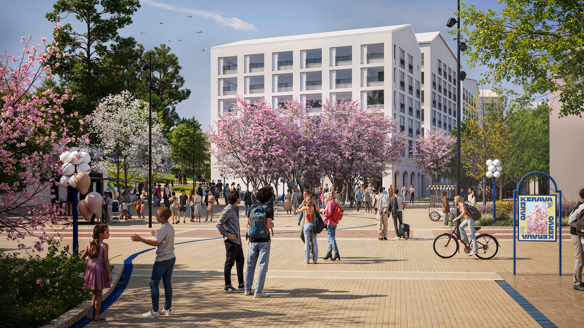
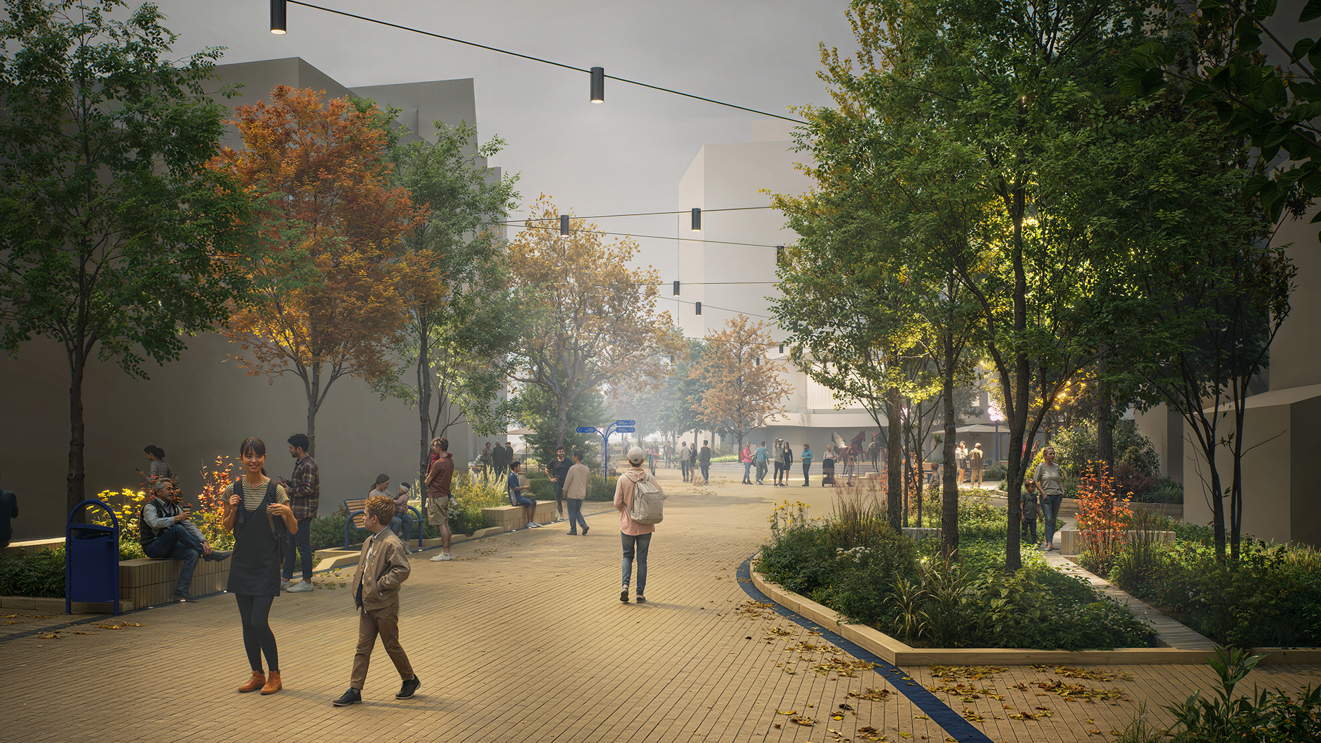
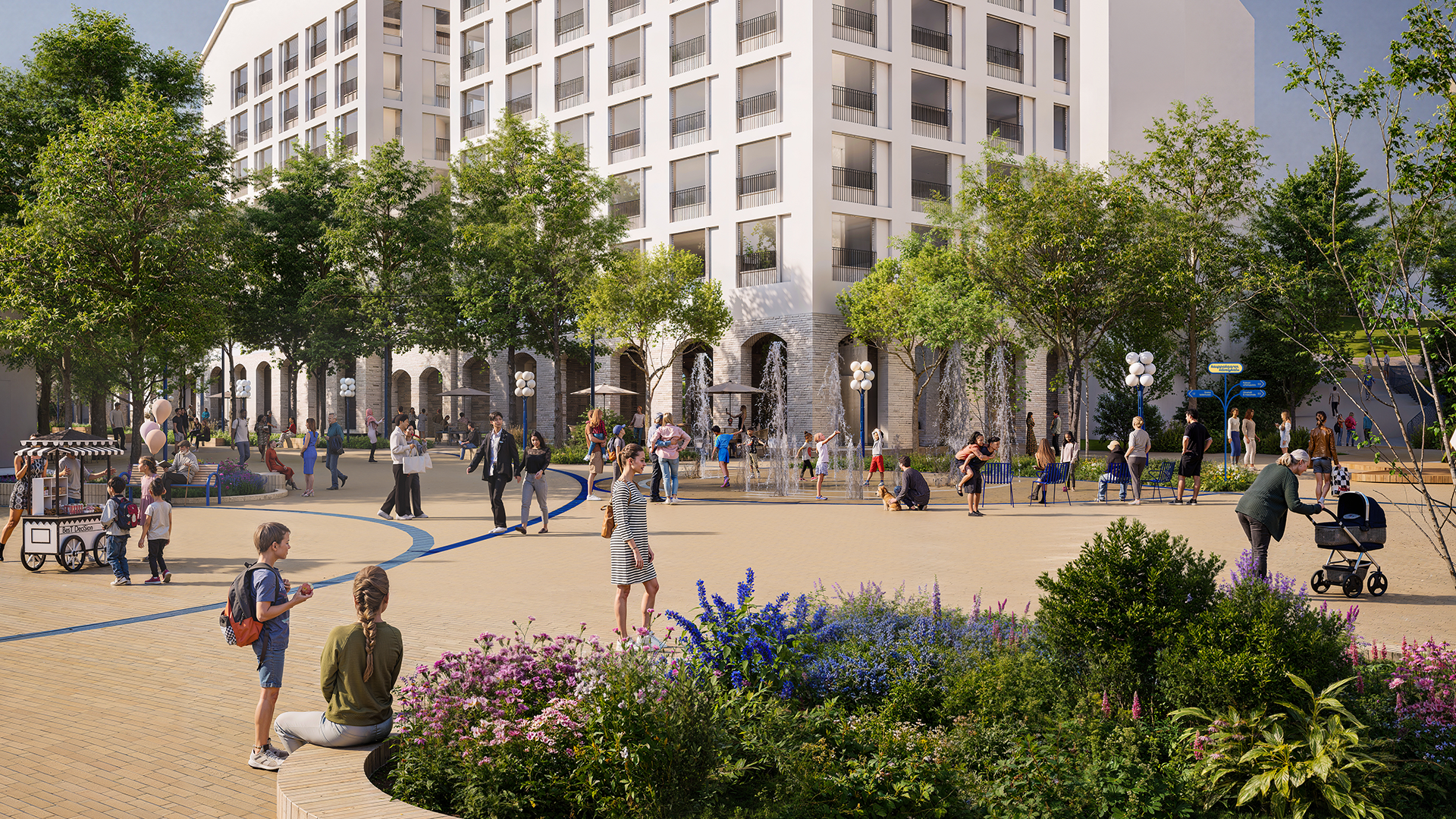
Our design vision is Sininen helminauha (The Blue String of Pearls), bringing Kauppakaari into a new era while preserving its most valuable characteristics. The proposal promotes equality and a sense of community by creating an accessible, safe and barrier-free pedestrian street for everyone, where everyday errands, lingering and social encounters can take place naturally.
In addition to the design of the public realm, the proposal examines the interfaces between buildings and public space from a broader perspective. An interesting and lively town centre is diverse in both its built form and its activities. It contains layers from different periods and even unexpected elements from the past or present. For this reason, we consider it important that the development of Kauppakaari creates something new without erasing the old.
The character of Kauppakaari’s public realm is shaped by the surrounding built environment. In the future, commercial activity will increasingly concentrate between Puuvallonaukio and Kerava Market Square, continuing south from Puuvallonaukio and north from the market square towards the railway station. The proposal responds to the changing emphasis of the area and develops the interfaces and functions of the public realm accordingly.
Visual identity and colour palette
The visual identity combines elements of Kerava’s coat of arms and the city’s visual identity into a distinctive identity for Kauppakaari. The overall concept is based on nostalgia, a bold colour combination and the tunnel-like forms created by the structures. Kauppakaari’s colours work well together while also offering both playful and heraldic options for establishing a colour hierarchy.
The typography combines nostalgic script lettering, emphasising the human-centred character of the area, with modern and clear typography for wayfinding. The navigation typeface meets current accessibility standards for public-space wayfinding.
Wayfinding
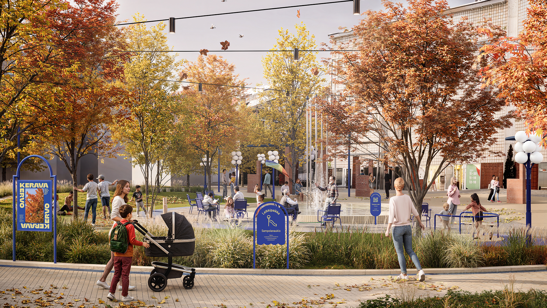
The wayfinding concept combines nostalgia with modern technology to create a distinctive and recognisable system for Kerava. The design of the signs takes its inspiration from the cherry blossom.
In terms of form, the signs complement both existing and refurbished street furniture by continuing the design language of the tubular steel elements. The selected design language builds on the area’s existing family of street furniture. The solution is based on supplementing and reusing existing elements.
Accessibility and barrier-free use have been taken into account throughout the signage design. The colour contrast of the sign text complies with the WCAG 2.1 Level AA accessibility requirement, with a contrast ratio of 7.3:1. Both large and small text, as well as graphic elements such as icons, are easy to read. In addition to static signage, interactivity has also been incorporated: users can scan a QR code to access further information, which is available in an easy-to-understand audio format in three languages (Finnish/Swedish/English).
The signs comply with accessibility requirements and support navigation for users with different needs: from long-distance orientation to quick visual reading at close range and detailed examination from nearby.
Directional signs are positioned at a height of more than two metres to improve long-distance visibility, durability and ease of maintenance. They provide information about destinations and distances, while their visual identity also indicates the spatial divisions of the pedestrian street.
Area information signs are positioned at approximately 1,400 mm, for example in connection with playgrounds, where they can be read at close range from no more than two metres away. They provide information about the defined area, its intended use and maintenance, and include contact details that support participatory communication.
Individual information signs are positioned at approximately 1,200 mm, for example in connection with public art. They provide accessible information about individual elements. Further information can be accessed easily via a QR code, supporting resident participation and interactivity.